Heuristic Rotating Header Image

Science

Wordless

I earned a science PhD from a North Carolina university (Duke ecology, 1998). Which makes the current piece of anti-science idiocity coming out of that state particularly appalling. Briefly, NC is trying to legislate the scientific methods that can be used to estimate future sea level rise for planning purposes. Their chosen methods are wrong, and put sea level rise considerably below more nuanced estimates, thus maintaining property values while likely screwing whole segments of the population.

Willfully inaccurate planning means that coastal development, roads, bridges, and people are all at risk. Not to mention research at the state’s many fine colleges and universities: it would apparently be illegal to use any methods other than those specifically legislated to predict sea level rise.

The legislated method: linear extrapolation from sea level records since 1900. That method predicts an 8-inch rise, and NC wants to use 16 inches as their worst-case scenario. The best scientific estimates from the IPCC put likely sea level rise at about 39 inches, if not more.

I see a problem here.

I really wanted to write something witty and insightful about this, but I can’t manage anything but a great deal of ARRRRRGGGGHH. So why don’t you go read Scott Huler’s SciAm rant instead?

ETA: Or Eric’s.

And if that’s too much for you, I enjoyed these two comics today, and wanted to share.

Fifty years

This set of photos from fifty years ago is amazing. 1962 is both not that long ago and incredibly far away.

It’s a wonder that anyone is brave or conceited enough to even try to write science fiction.

So true

Nikola Goddamn Tesla, from The Oatmeal.

That doesn’t seem like enough for a post. But it’s Tesla, so it must be.

Fishie

Although I’m still not convinced the sarcastic fringehead isn’t really an evil Muppet.

Science Paper Art

I saw Lisa Nilsson’s anatomical paper art on NewScientist this morning.

It’s gorgeous, and precisely hits my sweet spot linking scientific accuracy, beauty, and clever use of materials to mimic form.

Scientific visualization

I’m waiting eagerly for the computer to churn out the results I need for the talk I’m writing. I’m giving it a week from Monday, so some results would be nice. (Highly-trained professional, closed course. Do not attempt at home.)

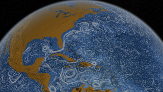
While I’m waiting, I’ve been looking at some recent scientific visualizations. Ways to portray data that are both informative and beautiful are an interest of mine, and these three examples are really quite good.

Perpetual Ocean: Animated map of global ocean currents from the Scientific Visualization Studio at NASA Goddard Space Flight Center. The video is lovely.

Hint.fm has put together a similar visualization for winds over the United States, only this one is near real-time. Then compare that to this NASA Earth Observatory map of two extreme circulation patterns that caused drought or flooding.

How about a look at atmospheric composition instead of currents? This visualization of carbon dioxide concentration in the atmosphere from NOAA’s Earth System Research Laboratory clearly makes the case that the Industrial Revolution changed not just society but the atmosphere as well.

And now, I have some data of my own to visualize.

It’s complicated

Jen Rhee sent me a link to a graphic that she and her team put together on girls in science and tech fields. There’s nothing in there that surprises me, but they’ve done a nice job pulling it together. I’m too busy doing science right now to have much to say about it, but I wanted to share, and I’d welcome any comments.

Girls in STEM

Originally from http://www.engineeringdegree.net/girls-in-stem and now stored directly here because of Engineering Degree’s administrative issues.

How I spent high school

Minus the YouTube, of course.

Let’s go for a ride

In a nice warm enclosed-atmosphere sleigh.

One of the most fascinating things about this, beyond the obvious “It’s another PLANET!!!!” thrill, is how useless terrestrial ideas of pattern and scale are. I spend a lot of time looking at satellite and aerial imagery, and still couldn’t tell you how large or what some of these features are.

The creators could have snuck some microscope images in there, for all I can tell.

Doing it wrong

Things I never learned in grad school:

Girl science is pink, and involves perfume, beauty products, soap, snowflakes, and “Beautiful Blob Slime.” (Please note: I did not make up that last.)

Boy science is blue, spooky and perilous, has physics and chemistry, and “Weird Slime Lab.”

There’s also cosmetic science, which is purple and involves cleaning products.

I’m all for encouraging girls to learn that science is fascinating and fun, especially by showing them that they can make fun things that they’re interested in. But really: gender-themed kits that only use scary words like “chemistry” and “physics” for explicitly male kits?