I’m waiting eagerly for the computer to churn out the results I need for the talk I’m writing. I’m giving it a week from Monday, so some results would be nice. (Highly-trained professional, closed course. Do not attempt at home.)
While I’m waiting, I’ve been looking at some recent scientific visualizations. Ways to portray data that are both informative and beautiful are an interest of mine, and these three examples are really quite good.
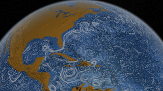
Perpetual Ocean: Animated map of global ocean currents from the Scientific Visualization Studio at NASA Goddard Space Flight Center. The video is lovely.
Hint.fm has put together a similar visualization for winds over the United States, only this one is near real-time. Then compare that to this NASA Earth Observatory map of two extreme circulation patterns that caused drought or flooding.
How about a look at atmospheric composition instead of currents? This visualization of carbon dioxide concentration in the atmosphere from NOAA’s Earth System Research Laboratory clearly makes the case that the Industrial Revolution changed not just society but the atmosphere as well.
And now, I have some data of my own to visualize.
